What’s in a brand guidelines document (and why it saves you money)
Logo rules, colour codes, fonts, spacing and the stuff not to do. What goes in a brand guide and why it stops your brand drifting.
 Designedby. homeBook a call
Logo rules, colour codes, fonts, spacing and the stuff not to do. What goes in a brand guide and why it stops your brand drifting.
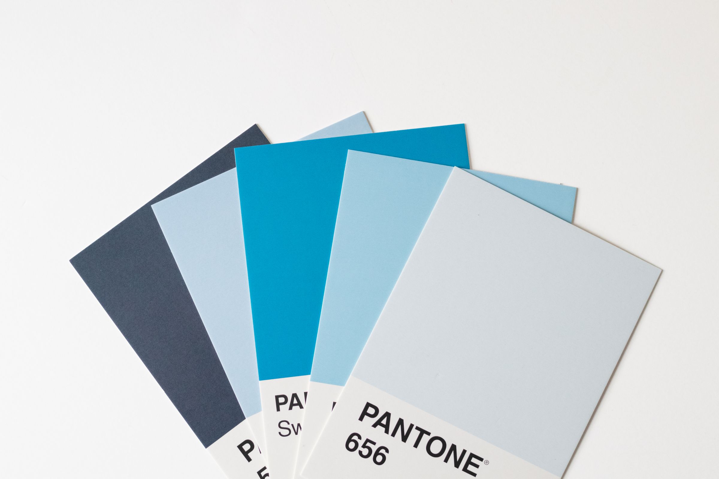
A brand guidelines document is the rulebook for your brand. It shows how to use your logo, lists your exact colour codes and fonts, sets spacing and sizing rules, and shows what not to do. Anyone making something for your business, from a sign shop to a new hire, uses it to get it right the first time.
Every business is different, but a solid guide covers these sections.
Examples of the logo stretched, recoloured, placed on a busy photo or crammed against the edge. Showing the wrong way is often clearer than describing the right one.
Examples on real things: signage, social posts, packaging, business cards, apparel. This shows people what "right" looks like.
For Deez Treez Smokeshop the guidelines cover the primary logo and its construction, clear space, the DT monogram for small spaces, secondary and alternate logos, brand colours, typography and tested colourways. Their sub-brand logos for the shop's own products follow the same rules, so every product looks like it belongs to the same shop.
As long as it needs to be and no longer. For a small business, 10 to 30 pages is normal. A one-page brand sheet can work for a brand that's just starting out. Big companies run to 100+ pages because they have hundreds of people using them.
A guide nobody reads is useless. Short and visual beats long and thorough.
Without a guide, every new vendor guesses. The printer picks a close-enough green. The new social media person uses a different font. The sign shop stretches the logo to fit. Each one is small, and every one costs you: reprints, redos, and a brand that slowly stops looking like itself.
This is common. In a Lucidpress survey of 400+ brand managers, 85% of organisations had brand guidelines, but only 30% consistently enforced them. Having a guide isn't enough. It has to be easy to use and actually handed to people.
A guide saves you money three ways:
People use these interchangeably. Loosely:
What matters is what's inside, not what it's called.
Every project I deliver includes guidelines and every file in every format, so nothing drifts. If your brand looks a little different every time someone new touches it, book a 15-minute call.
Logo usage rules, clear space and minimum size, colour codes (HEX, RGB, CMYK, Pantone), typography, supporting graphics, dos and don'ts, and examples on real applications.
To make sure everyone who creates something for your business uses the brand the same way, so it stays consistent and recognisable.
For a small business, 10 to 30 pages is typical. Shorter is fine if it covers logo, colour, type and usage.
Mostly, yes. Both describe the visual rules. A brand book sometimes also covers mission, values and voice.
If more than one person or vendor creates things for your business, yes. That's when brands start to drift.
Next step
15 minutes. No pitch deck, no pressure.